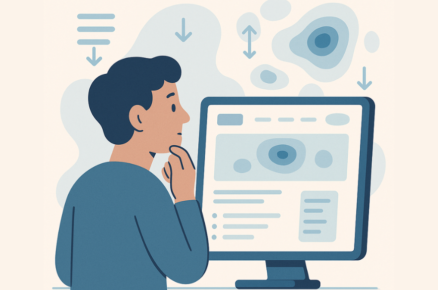
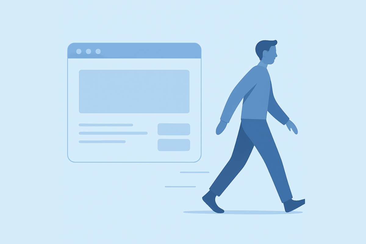
When someone arrives on your website and leaves almost immediately, it’s easy to assume the metric is the problem. “Bounce rate is too high, we need to reduce it.” But bounce rate is not the issue, it is the signal. It is your visitors telling you that something in the experience didn’t meet their expectation.
Understanding why people leave is far more valuable than simply trying to make them stay longer. A high bounce rate is a communication feedback loop. If we can interpret it correctly, it becomes one of the most useful UX diagnostic tools available.
What Does “High Bounce Rate” Actually Mean?
The answer depends on the type of page. A high bounce rate on a blog post can be normal. A high bounce rate on a homepage or service page is more concerning.
Contentsquare’s 2023 Digital Experience Benchmark Report found that the average bounce rate across industries is roughly 47%, but blog pages are naturally higher, and service/product pages are expected to demonstrate value faster:
So instead of asking “What’s a good bounce rate?”, ask:
“Is this page achieving the job it exists to do?”
If the answer is unclear, the page will quietly fail, no matter how good the visuals are.
Why Visitors Leave So Quickly
1. The page loads too slowly
Speed is the first impression. Google’s performance research shows that 53% of mobile visitors abandon a page that takes longer than 3 seconds to load. If your site feels slow, users do not even wait long enough to evaluate your content.
2. The message is unclear in the first 5–10 seconds
Nielsen Norman Group research shows users make “stay or leave” decisions in about 10 seconds. This is where most bounce issues originate. If the first screen of your site doesn’t tell the visitor:
- What this is
- Who it’s for
- Why it matters
- What to do next
They leave.
Not because they don’t need you; because they can’t immediately see that you’re relevant.
3. The page doesn’t match the visitor’s expectation
Bounce rate spikes when:
- The ad says one thing, the page says another
- The headline promises something but the content shifts topic
- The user thought they’d land on a solution page; but lands on a company bio
Relevance is the core of retention. If expectations and experience don’t align, the visitor exits.
How to Understand What Your Visitors Are Actually Experiencing
Instead of guessing, we observe. Tools like Hotjar or the free Microsoft Clarity show where users click, scroll and pause.
These uncover patterns such as:
- Buttons no one notices
- Sections no one reads
- Areas users expect to interact with but cannot
This is direct evidence of UX friction.
Session replays show confusion in motion. Watch real visitor sessions:
- Do they hesitate?
- Scroll rapidly looking for something?
- Click the same element repeatedly?
This is how you learn where clarity breaks down.
How to Fix High Bounce Rates (Without Rebuilding Your Website)
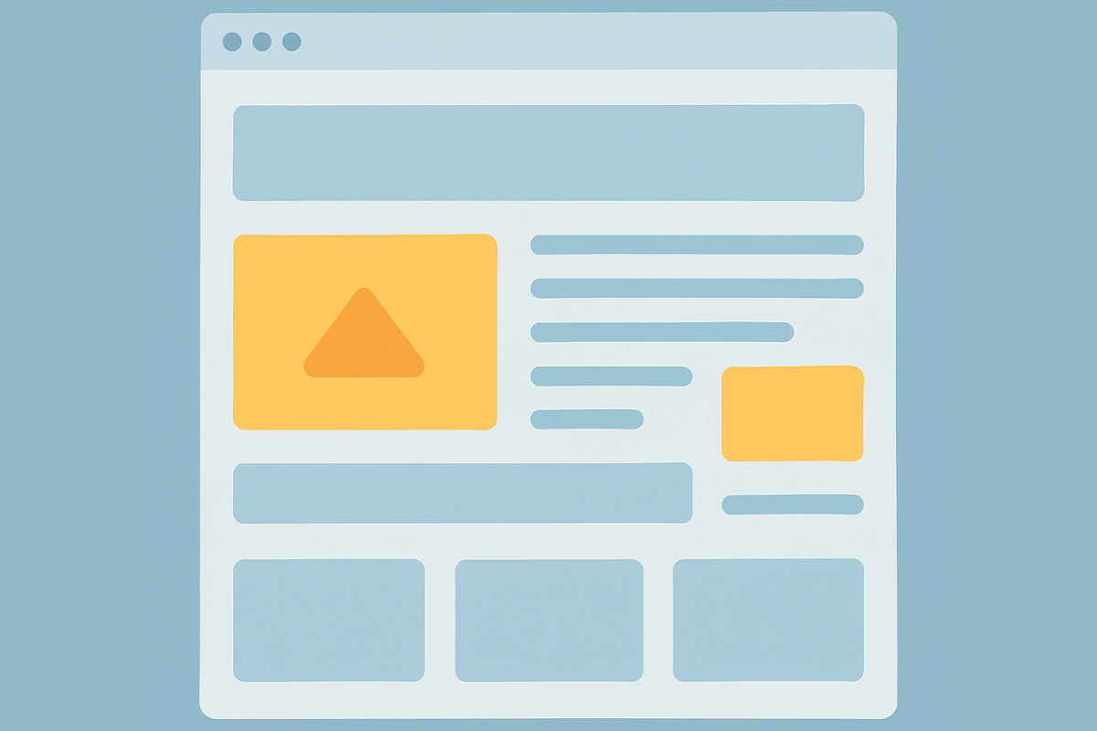
1. Clarify your above-the-fold message
The top of the page should answer:
- What do we do?
- Who do we help?
- Why does it matter?
Example structure:
Headline: The result you help customers achieve
Sub-heading: Who you help + how
CTA: The next logical step
This reduces cognitive effort, retention goes up immediately.
2. Simplify your navigation
Navigation is the map, if the map is confusing, the journey ends early.
Reduce:
• Overlapping menu labels
• Dropdowns-within-dropdowns
• Pages that sound similar but do different things
A clear menu = a clear experience.
3. Improve readability and content structure
People scan, they do not read.
Use:
- Short paragraphs
- Meaningful subheadings
- Visual section breaks
- One idea per screenful
If the content feels heavy, the exit happens fast.
4. Make your calls to action obvious, but not overwhelming
Your website should guide, not pressure. Good CTA strategy looks like:
- Guidance at every stage
- One logical action per page section
- No competing or conflicting choices
A CTA is not an instruction., it’s an invitation.
5. Align landing pages to visitor intent
A homepage cannot serve every purpose at once. Match page to purpose:
| Traffic Source | Page Should Deliver |
| Search | Information + next step |
| Ads | One clear solution message |
| Continuation of a story already begun |
Conclusion
A high bounce rate is not a technical problem, it’s a clarity problem. Your visitors are telling you where the experience breaks. Your analytics are telling you where to look. Bounce rate is simply the language your users speak before they ever send you feedback, email, or complaint. When you improve clarity, you improve trust, confidence, retention, and conversion.
At I-Net Software Solutions, we specialise in UX audits for UK SMBs, identifying where visitors lose clarity, confidence, or momentum.
If you’d like to understand why people are leaving your site, we offer a UX Audit Consultation focused on:
- Uncovering friction points
- Reviewing real user behaviour
- Providing a clear action plan
→ Book your UX Audit Consultation
Recommended Next Insight
How to Improve Mobile UX Without Rebuilding Your Whole Website