In 2025, mobile devices account for over 50% of web traffic in the UK. Yet despite this dominance, mobile conversion rates lag behind desktop, often due to avoidable UX issues. The good news? You don’t need a full website overhaul to improve mobile user experience. With targeted mobile UX tips and responsive design fixes, even small and mid‑sized businesses (SMBs) can boost engagement, reduce friction, and lift conversion metrics. This article outlines cost‑effective strategies for mobile UX optimisation you can deploy now.
Why Mobile UX Matters Now More Than Ever
Mobile traffic is significant, but mobile usability is still a competitive gap. According to recent data:
- In the UK, 90% of consumers reported using their smartphone to shop online at least sometimes.
- Over 88 million UK mobile connections indicate widespread device usage and mobile‑first behaviour.
- Research shows responsive design strongly impacts usability; e.g., in a study of university students, 99% used smartphones and 91% expected mobile‑optimised content.
This means, if your site isn’t delivering smooth mobile interactions, you risk losing over half your traffic to frustration or abandonment.
Five Cost‑Effective Mobile UX Fixes for SMBs
1. Prioritise Page Performance
Load time directly impacts user satisfaction. Studies show that poor performance leads to higher bounce rates and lower task success. Use Chrome DevTools or PageSpeed Insights to check mobile load. Minify CSS/JS, defer non‑critical scripts, optimise images, and enable caching.
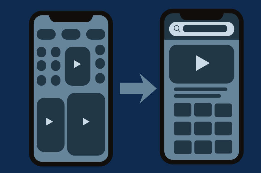
2. Simplify Navigation and Interface
On smaller screens, clutter kills clarity. Ensure your primary action stands out and minimise menu depth. A responsive design study noted layout changes can reduce cognitive load for mobile users. Use a “hamburger” or bottom nav bar for core functions, hide less used items behind secondary menus.
3. Use Responsive Frameworks, Not Desktop‑Before‑Mobile
Many older sites were built desktop‑first then “shrunk” for mobile. This often creates inconsistencies. The Nielsen Norman Group warns mobile‑first sites when rendered poorly on desktop cause “content dispersion” and user frustration. Without rebuilding, you can adjust breakpoints and restructure modules so mobile gets priority. Use flexible images, % widths, and viewport‑based typography.
4. Focus Form Design and Input Efficiency
Form fields and data entry are pain points on mobile. According to recent mobile vs desktop stats, the average mobile checkout takes 40% longer than desktop. Use auto-fill, single‑column fields, large tap targets, and minimal required fields. Provide clear inline help.
5. Visual Feedback & Touch‑Friendly Interactions
Mobile users expect responsive feedback, taps, swipes, and transitions must feel natural. Usability research shows mentionable issues still exist in mobile apps around interaction design. Use micro‑animations for actions (e.g., checkmarks after form submission), ensure touch targets are 44px+ in size, and avoid hover‑only behaviours.

Mobile UX Checklist
| Area | Quick Fix | Why it Matters |
| Load Speed | Compress images, defer scripts | Slow loads = bounce |
| Navigation | Simplify primary menu to 3‑5 items | Easier to find key tasks |
| Layout | Use 1‑column grid under 768px | Reduced cognitive load |
| Forms | Use large taps, minimal fields | Easier data entry on mobile |
| Touch Feedback | Add animations or haptics | Keeps users engaged and informed |
Measuring Success & Next‑Level Enhancements
After implementing fixes, track metrics to validate improvements. Key performance indicators (KPIs) include:
- Mobile bounce rate
- Session duration on mobile
- Conversion rate on mobile
- Progressive Web App (PWA) features
- Offline caching for mobile users
- Voice or gesture interface for mobile UX evolution

Conclusion
Improving mobile UX doesn’t demand a full‑site rebuild, it demands targeted action. By focusing on performance, navigation, responsive frameworks, form usability, and touch feedback, you can deliver a mobile experience that matches desktop expectations. For SMBs working with limited resources, starting small and measuring wisely can yield major gains.
As the UK continues to shift toward mobile‑first behaviour, with smartphone ownership at over 93% of adults, the urgency is clear. Every small business website must deliver mobile clarity, speed and usability. By applying these mobile UX tips now, you position your business to engage mobile users confidently and convert them effectively.
Improving your mobile experience doesn’t have to mean rebuilding everything. At I-NET, we specialize in fast, high-impact UX audits tailored for small and mid-sized businesses. We’ll help you fix what matters, without the technical bloat.
Book a free 15-minute Mobile UX Consultation
Recommended Reading
If you care about the finer points of user experience, you’ll love our deep dive into interface writing:
Why Your Interface Words Matter More Than You Think, Learn how microcopy affects trust, conversion, and flow across your digital product.